The first logo was a ring with a grain inside. It was made quickly, and you could tell. With the site, the platforms and the daily videos, something was needed that works everywhere: as a tiny symbol in the browser tab, as a profile picture, on a banner and at the start of every video.
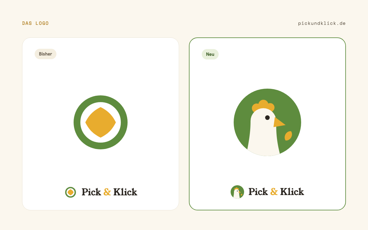
On the left the old mark, on the right the new one. The grain stays, it just moves in front of the beak.
The hen
The new mark is a pecking hen in cream inside a green circle. Comb and beak are honey yellow, in front of the beak lies the grain, the same diamond-shaped grain as before. Next to it the name in a serif typeface, the ampersand in honey.
There were alternatives, eight of them, with other grain shapes and other poses. In the end the simplest one won: one hen, one grain, one circle. You can still recognise that at 16 pixels.
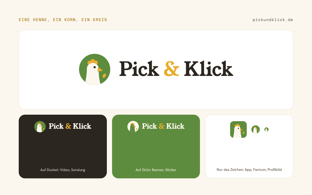
The logo comes in a few fixed forms: the wordmark with the mark for the site header and for banners, the same on a dark ground for video and broadcast and on green for stickers, and the mark alone as an app icon and as a favicon. At the bottom right of the picture the hen at 32 and 16 pixels, the way it sits in the browser tab.
Colours and type
The site gets a fixed colour world to go with it: a warm cream as the ground, a dark brown for text, honey and green as accents. Headlines run in a serif typeface, body text in a clean grotesque, numbers and dates in a monospace face. All of that roughly existed before, now it is written down, and the images for Twitch, YouTube, Kick and Facebook are built from it.
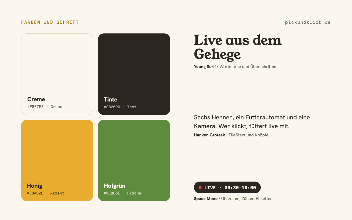
The four colours are called cream, ink, honey and farm green. Cream is the ground, ink the text, honey the accent for comb, grain, the ampersand and the buttons, farm green the surface behind the hen. The three typefaces are Young Serif for the wordmark and headlines, Hanken Grotesk for body text and Space Mono for times, counters and labels, such as the LIVE badge above the picture.
The favicon in the browser and the icons on the phone have been the hen ever since.